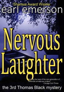
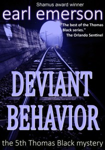
 The Kindle and Nook version of Nervous Laughter is now online. With this addition, all five of the first Thomas Black private eye mysteries are on line. We’re working on the next five. Cinelli has given us an updated cover for Deviant Behavior. I’d like some feedback on which cover is preferred. Book covers are always problematic. It’s hard to tell if people are buying the storyline or the cover, or just completing a series.
The old Deviant Behavior cover.
The new Deviant Behavior cover.  Which do you prefer?
Both these covers are replacing the absolutely hideous cover Ballantine slapped onto it in 1998. All I can think of is that somebody in the house must have gone temporarily insane.
Lastly, you can purchase Nervous Laughter at your Kindle store or at Barnes and Noble —coming shortly.

A short note on typos. We proofread these titles scrupulously but we’re only human. If you find a typo, please notify me and I’ll amend the e-books pronto. The problems are multiple. In the beginning, a lot of it had to do with the Kindle platform and the translation. Most of the first mistakes in the first few Kindle books we put on weren’t ours. Well . . . a lot of them were ours. But a lot of them were translation errors and not our fault.
We download a Word document formatted properly, then read the kindle translation, then okay it. But what we read in the sample is not what always shows up in the finished product. It was frustrating. Kindle has revised their technology and now they even have a spellchecker which found four typos in this last manuscript. Bravo.
- Deviant Behavior cover by Cinelli.


Like both new covers! So glad about the spellchecker. I hate having to read with typos!! Keep up the good work and get the new book out soon!
I much prefer the cover with the railroad tracks. The one with the silhouette of a man looks like many another cover of recent years.
I agree, the one with the tunnel is better.
I prefer, by far, the tunnel version.
Another vote for the Tunnel!
Interesting insight into cover artwork choices. I didn’t realize authors had so little say in the matter.
Add A Comment